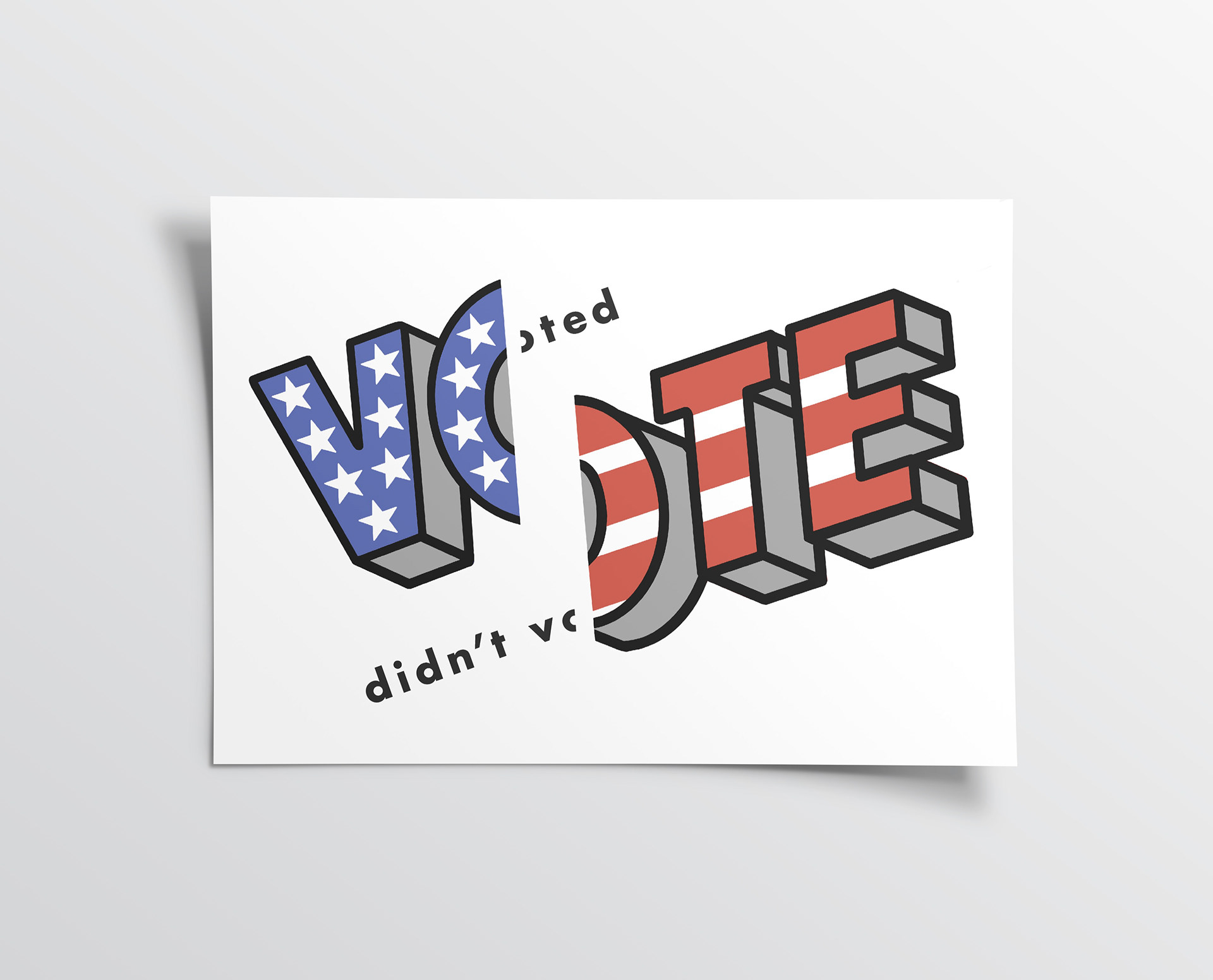
There are many aspects of my final work that were thought through in roughs before being chosen. After I had my concept set, figuring out how to represent a graph without using numbers or a plain graph was difficult. In fact, I became so frustrated that I put my idea aside and intended to make something that would have been done before. My professor encouraged me
to stay on track. We discussed splitting my vote illustration into 1/3 and 2/3 to represent the difference in voters. After that, I knew that there had to be extra type added to really get the point across. I chose the Futura typeface because it was the inspiration for the graphic I had made. I then put the words voted and didn’t vote in the amount of points that mimicked the weight of the lines in the illustration. I then cut the O in half so that it read altogether and picked between varying shades of blue and red to get to the final poster.
to stay on track. We discussed splitting my vote illustration into 1/3 and 2/3 to represent the difference in voters. After that, I knew that there had to be extra type added to really get the point across. I chose the Futura typeface because it was the inspiration for the graphic I had made. I then put the words voted and didn’t vote in the amount of points that mimicked the weight of the lines in the illustration. I then cut the O in half so that it read altogether and picked between varying shades of blue and red to get to the final poster.
Printed on 20”x 15” matte photo paper